
 Yahoo Finance
 This is the best font for your resumé


When it comes to you creating your resumé, you can be creative – within limits.
Some industries are more conservative than others, and call for a clean, simple layout, while those working in design have more leeway to be creative and colourful.
But for recruiters, who look at dozens of resumés a day, an easy-to-read resume can be what gets you over the first hurdle.
Also read: Delete these eight words from your resumé immediately
Also read: These jobs that don’t exist yet could end up on your resumé
Also read: 5 resumé mistakes to avoid and what to do instead
“Applicants should use their resumé to carve a point of difference from the competition through their skills, capabilities, and experience, not through a flamboyant font,” recruitment firm Robert Half director Nicole Gorton told Yahoo Finance.
A simple, clear font will make the recruiter’s role easier.
“Providing a clear and legible resumé that is well structured and easy to read may be advantageous to consideration for a role over a resumé with difficult to read fonts,” she said.
What makes for a good font?
According to the recruitment firm, there are three elements that make for a good resumé font: it should be easy on the eyes, clear, and non-distracting.
It shouldn’t cause any strain or confusion, and the font should stay clear even when it’s in italics or bold. And finally, the font itself shouldn’t steal attention away from what you’re trying to get across, which is your experience and your skills.
“Just like a glaring typo, a distracting resumé font will take away from what you're trying to sell – yourself,” Robert Half stated on their website.
So what’s the best font for my resumé?
While there’s no hard-and-fast rule or clear winner for this, there are a few usual suspects.
Gorton told Yahoo Finance fonts like Calibri at size 10 to 12 will “look polished on screen and paper, are not too condensed, and are neutral but still professional”.
But if Calibri isn't your font of choice, Arial, Times, Georgia, Garamond are also safe bets.
“[Arial] is a standard resumé font, but it's not particularly sophisticated,” said Robert Half on its website. “It's a sans serif font that many of us are familiar with, especially when browsing the internet, but it may border on banal. Nonetheless, Arial is a safe bet.”
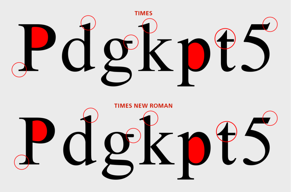
If you’re a dedicated Times New Roman fan, there’s actually a variant you may not have known about: simply ‘Times’. This is preferred to the New Roman version. The differences are very subtle, but they’re there: Times New Roman has thinner serifs and a rounder ear on the ‘g’, among a number of other small differences.
“The letters appear less awkward and condensed, especially at smaller sizes, thus making it ideal for digital use,” said Robert Half.
However, a Seek spokesperson told Yahoo Finance that a sans-serif font was preferable.
“People respond best to easy-to-read fonts, that are a good size when held a metre from eyesight,” the spokesperson said. “For a clean and sleek look and feel, choose a standard, sans-serif font such as Arial, over outdated serif fonts, such as Times New Roman.”
Indeed career expert Jay Munro agreed, adding that Times New Roman was fading from popularity and that current best practice was to use a sans-serif font like Arial.
“Arial is the most commonly used font amongst professional documents because it’s installed on most devices and it’s been around for a while,” Munro said.
You won’t know what device your recruiter is using – so a font like Arial will be readable across all types of computer systems.
“Helvetica is a widely popular font but not all devices have it – meaning it could display incorrectly or ruin your formatting if it’s not installed on your hiring managers device,” he warned.
However, if you’re inclined towards serif fonts, Georgia is less common than Times, which might help you stand out. “It was designed for computer screen reading, so it's both easy and pleasant to read,” said Robert Half.
Meanwhile, Garamond will carry a simple elegance that will help you come across as sophisticated and polished, both in print and screen.
Make your money work with Yahoo Finance’s daily newsletter. Sign up here and stay on top of the latest money, news and tech news.
