
 Yahoo Finance
 Australia’s surprise superannuation hotspot
While Australia's super system is giving some people a very tax-advantageous way to save, it's failing to give others enough to fund their retirement.
If you tell me where you live, I can guess your superannuation balance. It turns out that, when it comes to how much people have saved up for retirement, location matters.
The super sweetspot is our nation’s capital. As the next chart shows, the top place for super balances is the ACT, where the average balance is more than $220,000. The worst place is regional Northern Territory, where the average balance is around $100,000.

Regional areas tend to show up lower on this chart, while capital cities and other urban areas tend to show up higher, but there are some interesting exceptions.
Why is the ACT so well-off? IT has to do with all the public servants. Private sector employees get 9 per cent super. But the federal government pays 12 per cent. It has to do something to keep people living in Canberra! The extra payments result in higher balances.
Also by Jason Murphy:
Melbourne and Sydney are also up high (look for the bars marked ‘capital city’). But, looking at this chart, you see some weird stuff. Tasmania is really high. That is surprising since Tasmania is not usually on any list of the richest parts of Australia. What’s going on there?
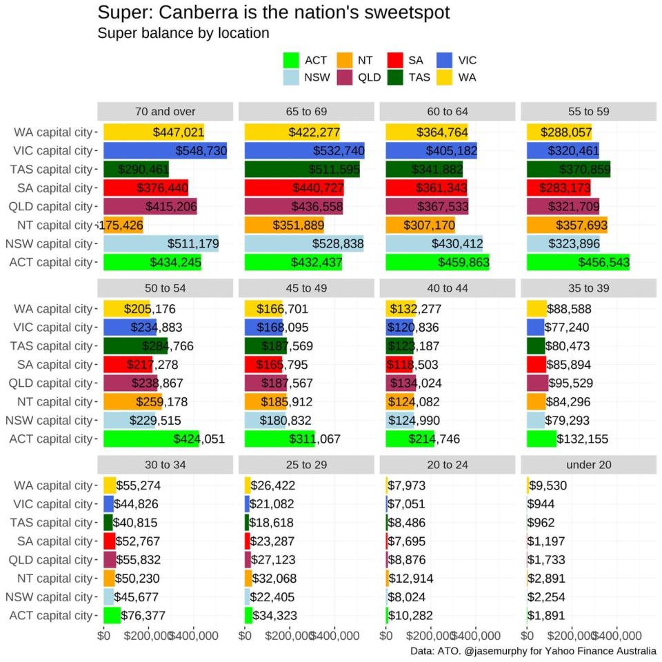
One theory is Tassie has lots of old people, and old people have more super. So, we need to break this down by age group. To simplify, let’s just look at the capital cities, and see the average balance for each age group.
This next chart shows Tasmanians actually do have healthy super balances. There are a lot of older people, but those older people are prepared for old age. Only in the over-70s bracket do Tasmanians have less super, on average, than most other capitals.
The chart also shows Canberra with very healthy super balances across the life course. The exception is the over-60 cohorts - we might speculate that perhaps the subset of Canberrans with loads of money in superannuation leave our chilly capital when they retire.
What about the young?
Melbourne has the lowest average super balance for those aged 35 to 39, but the highest for those aged 70 and over. There’s a similar pattern in Sydney. In fact, young people in our biggest two cities look to be doing the worst on super. But the old are doing better. My guess is this has a lot to do with house prices. Young people need to keep money out of super to help pay for a home. You can’t buy a basic $1 million house in Sydney and stuff your superannuation account at the same time.
But older people in Sydney have very healthy super accounts. That’s probably because if you pay off your mortgage, you suddenly have plenty of spare cash. Remember that salaries are highest in Sydney. Sydneysiders can load up their super accounts in time for retirement.
Median vs Mean
Now, we’re going to do something technical and look at medians instead of means. Remember: The mean can be dragged up by outliers. If one person has tens of millions of super, it can make the mean look higher. Medians aren’t like that. So, If we look at medians, what do we see?
The numbers are lower. But the pattern is similar for all age groups … except the 70+ group.

In that group, the median super balance suddenly looks pretty low. Why? By the time they are over 70, some people have withdrawn their super, some have turned it into an annuity, and many people have simply spent it. Meanwhile, others have amazing sums stashed away.
The next chart illustrates that exact fact. It shows the distribution of super among those aged 70+ in each city. Every city is broken down into 20 groups, each with 5 per cent of taxpayers - from the 5 per cent with the lowest super balance to the 5 per cent with the highest super balance. You can see that super becomes extremely uneven among the old: the top 5 per cent of people have millions and millions of dollars in super, while the bottom 50 per cent have none.
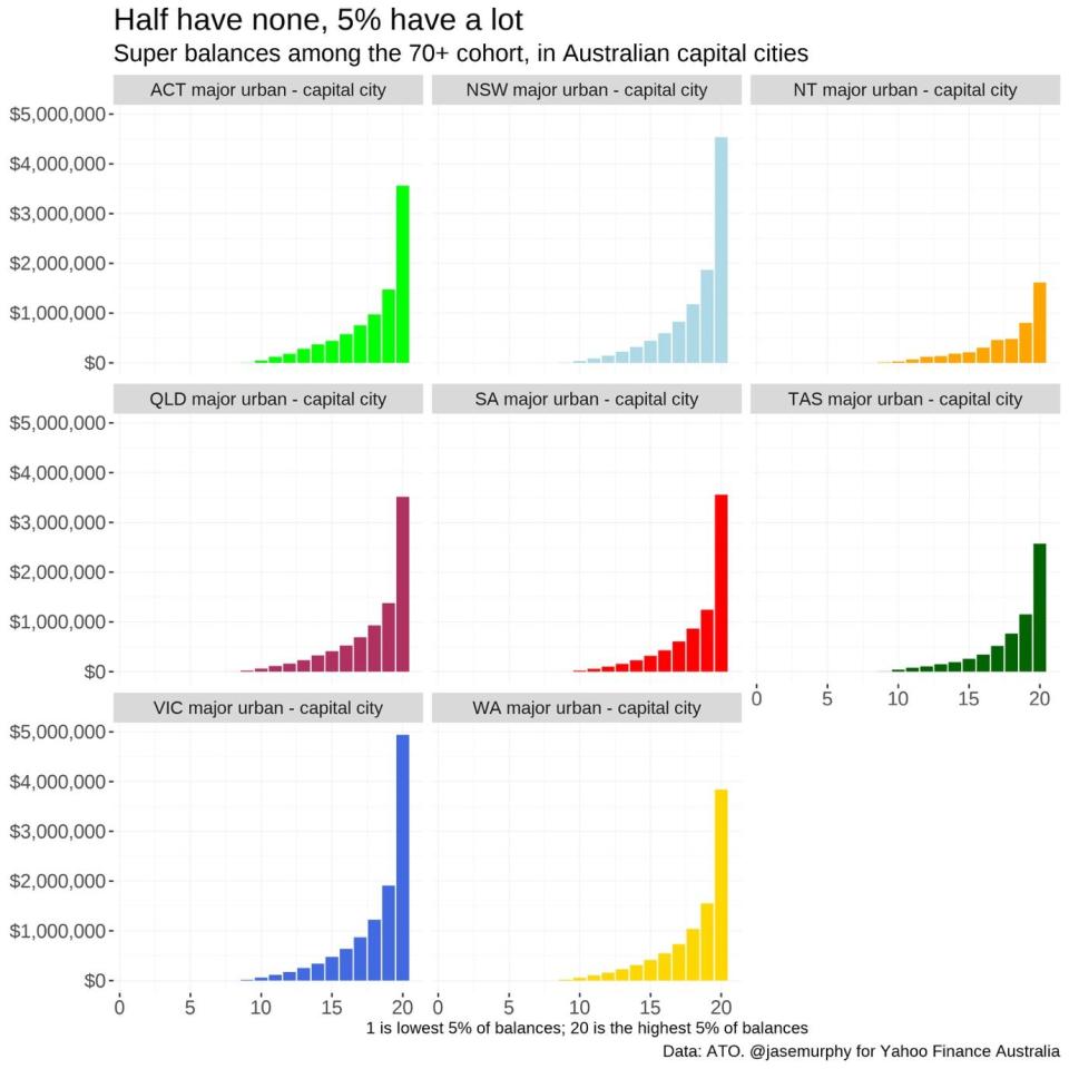
This is the whole point of super: to help people cover their retirement. But, by the time they’re in it, almost half of people have none left. Meanwhile, a small subset have so much they can’t possibly spend enough to make their balances go down.
On a personal level, that’s probably a good life goal! But, from a policy perspective, the data shows that the super system is giving some people a very tax-advantageous way to save, while failing to give others enough to fund their retirement.
Follow Yahoo Finance on Facebook, LinkedIn, Instagram and Twitter, and subscribe to our free daily newsletter.
